Google Analytics Changes Charts to Bridge Accessibility Gap
Right before the European Accessibility Act (EAA) became enforceable in June 2025, Google Analytics (GA) quietly rolled out a subtle but important update: their charts suddenly became much more accessible. I’ve been using a lot of Google products, and when diving into accessibility I often look at reputable websites & application in a hope to find a good reference only to discover … chaos. And that they’re far away from setting a good example in accessibility.
Let’s go into some of Google Analytics charts and the changes that were rolled out just before the EAA came into place. If you compare the before and after screenshots, the change looks tiny. But for accessibility? It’s actually huge.
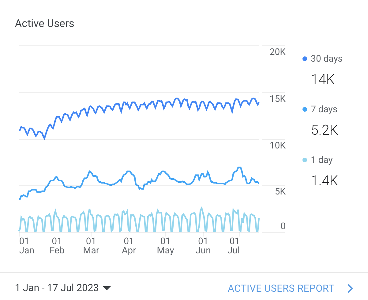
Before: Monochromatic color schemes
The old GA charts used color palettes that used different shades of the same hue family (blues, purple-blues, lighter & darker tones of blue and purple). This color pallettes usually work better for color blindness and when having charts with less data points. Monochromatic color schemes preserve the “distance” or contrast between the colors and therefore don’t cause issues for color blind people. But if they don’t contain enough contrast between the colors they can be pretty difficult to distinguish.
Why is contrast (against background and between colors) important? On screens with reduced brightness, washed-out or monochromatic screens, the differences in color really matter and on the top of this, there is a biological limit of “how different the colors should be, that they’re visibly different”. This applies to all, no matter if you’re color blind of not.
The downside of monochromatic color schemes is that humans have terrible color memory. Even more when it comes to hues and shades. While you can remember that something is “blue”, “red”, ”yellow”, distinguishing and memorizing tones is pretty much out of our capacity. Forget about remembering “lightly-purple-blue” and “lightly-more-blue-than-purple” in color scheme.
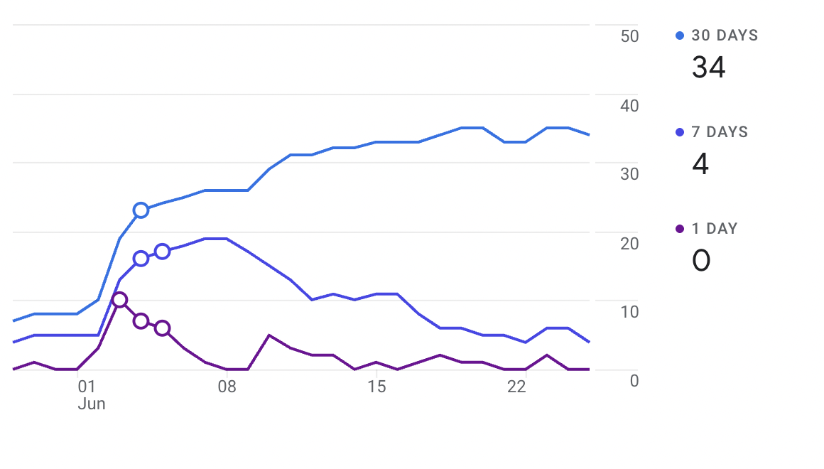
On other hand it’s worth to mention that the charts are interactive, when you hover the data line the others get dimmed.
After: Polychromatic colors + symbols
Google has changed liner charts to use distinct hue families: blue, green, orange, (additionally dark purple and pink).


Each data line has also assigned geometric symbol: circle, square, diamond, triangle. Symbols are repeated along the line path, not just in the legend.
This might look like a design flourish, but it’s actually accessibility best practice. There is a WCAG point (1.4.1 Use of Color) that says “color is not the only way to convey the meaning, actions and distinguish element”.
Color + Shape = Accessible Encoding
Relying on color alone is a failure per WCAG Success Criterion 1.4.1 – Use of Color. Adding shapes means: that color-blind users can differentiate series. Users on low-quality screens or bright sunlight can still track lines.
While the new color scheme might look a bit more happier and warm, it actually has less contrast, which makes it not so friendly for color blindness. Mind, color blindness is fairly common, roughly around 5-8% of men and ~0.5% struggle with color perception.
Still, room for improvement (no one is perfect)
Even with this update, a few accessibility issues remain:
1. Better color contrast against background and between series
WCAG recommends minimum 3:1 contrast ratio between non-text visual elements that convey meaning (strongly advised for distinguishable charts).
Example: the new orange is 2.69:1 against white — close, but not technically sufficient for visual element carrying a meaning. Similar, the light blue from monochromatic blue 2025 is down to 2.33 against white.

Furthermore, the color scheme from early 2025 had better contrast against white background (at least 4.55:1 or more) and more contrast between the colors in the batch (between 1.4 and 2.2; measured for 3 colors). The new color scheme (polychromatic, late 2025) has less contrast against background (up to 4.55:1 against white) and the least contrast between colors in the group (from 1.15-1.68) from all the sets.
The second color scheme GA still uses for non-linear charts is monochromatic blue, which has lower contrast than early 2025, but slightly more in average compared to polychromatic 2025.
Curious how these compare by different types of color-blindness?

Let’s add another improvement to the pie charts GA currently uses (monochromatic blue scheme). Surely the charts are interactive, and hover over the part of the chart or the label highlights the data you’re looking at; but I’d like to see the default state clearly without the need to interact with them.
WCAG recommends adding a border to increase the contrast between the colors. Using a clear visual separator helps distinguish the color/data changes.

2. Labels can truncate depending on screen size / zoom settings
This touches WCAG 1.4.4 – Resize text and 1.4.10 – Reflow. Users should be able to zoom up to 200% without losing information. Content shouldn’t be cut off, overlapped, or hidden.

GA sometimes collapses or truncates labels when zoomed or rendered in low-width layouts.
While the example might be trivial, for a data tool missing or truncated labels is more than a cosmetic issue — it can affect comprehension and task completion.
The takeaway
Google Analytics’ last-minute chart update wasn’t just a redesign — it was a move toward EAA compliance and WCAG-aligned best practices.
Is it better?
Adding the symbols was pretty much necessary to improve accessibility. I think that choosing a color scheme everyone can differentiate should also be considered - for color-blind people the new color scheme performs worse. While polychromatic works fine for our lazy brain, choosing three primary colors that satisfy both conditions (also the WCAG contrast) can make everyone happy.
For example, swapping the orange with dark purple from early 2025 would bring three different colors to all users. Or merging two monochromatic schemes that have different enough hues (if we need more colors).
Surely GA data is not only available in charts, but also in text and tables, but as a tool with high focus on data and data visualization, I’d like to see better color scheme used, and no need to click to “see” the data you want to see.