Accessible Typography: A Designer's Guide
Typography is the base information carrier when it comes to design. When it’s done well, nobody notices — we simply read, understand, and move on. When it’s done poorly, users struggle, bounce, need to move our screen or even zoom in just to decode a paragraph. As designers, we shape readability more than any other discipline, and accessible typography isn’t just something that looks nice to you — it’s about making our work usable for all humans in all conditions.
Here is a practical, WCAG-aligned guide to help you design typography that’s beautiful, functional, and inclusive.
You have probably seen bunch of articles about the text color contrast, but WCAG doesn’t only speak about contrast when it comes to text.
1. Color Contrast for Text
There was a time in UI design when gray was the new black. Some designers might still feel love for tasteful grey; or you might be working on design with bright colors without much actual contrast.
Colors are definitely not illegal when it comes to accessibility, but text must meet the minimum contrast against the background. So check that first when designing!
1.4.3 Contrast (Minimum) (AA) 1
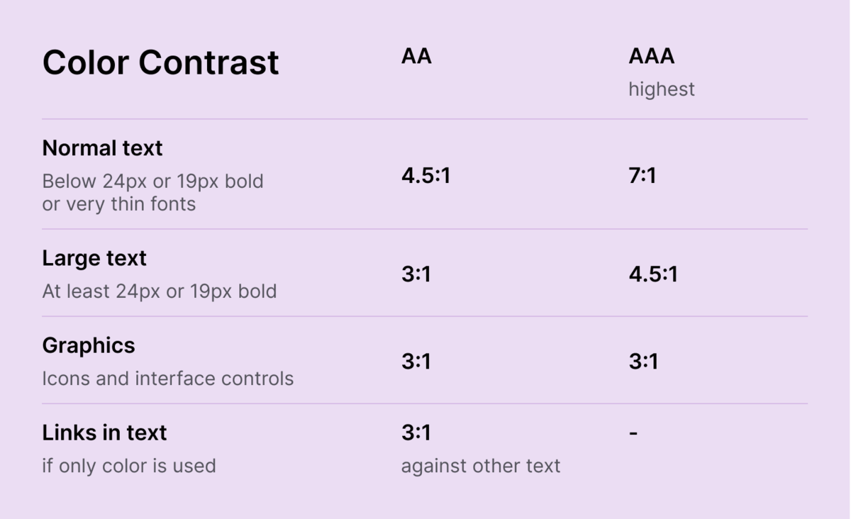
- Normal text (including images of text) must meet at least 4.5:1 contrast ratio.
- Large text (and images of large scale text) must have a contrast ratio of at least 3:1.
What is a large and a normal text?
Large text is everything at (or above) 18pt for regular and 14pt for bold. Mind, the units are in points, not in pixels. Pixels are device dependant, but WCAG also provides the “official” conversion of 1pt = 1.333px, so 14pt and 18pt are equivalent to 18.5px and 24px.
Mind, unusual and thin fonts (or “extraordinarily thin strokes”) are excluded from “Large text” as per WCAG.
So, the contrast should be 4.5:1 for text smaller than 24px or smaller than 18.5px if bold, or 3:1 for anything bigger.
Also, when calculating the contrast, WCAG doesn’t allow rounding, so a contrast of 2.999:1 would not meet the 3:1 threshold.
Are you using different (or dynamic) font sizes for web and mobile? Make sure both contrast requirements are always met.
1.4.6 Contrast (Enhanced) (AAA) 2
- Text and images of text have a contrast ratio of at least 7:1
- Large text (and images of text) have a contrast ratio of at least 4.5:1
If you’re looking for highest criteria of accessibility, then the contrast for regular text up to 24px or 18.5px if bold, should be 7:1, and for large text 4.5:1. This applies to all text, except of disabled buttons and controls. Same definition for large text applies as in 1.4.3.
Also mind that, not all fonts are visually equal at the same pixel size — test them.
1.4.11 Non-text Contrast (AA) 3
Surely this criteria doesn’t refer to text, but to any other important or meaningful visual cues - user interface components and graphical objects.
Meaningful visual cues achieve 3:1 contrast against background.
This applies to icons (unless text is present) and user interface components (defined as “perceived by users as a single control for a distinct function … including form elements and links”).
1.4.1 Use of Color (A) 4
Color is not the only way of distinguishing information.
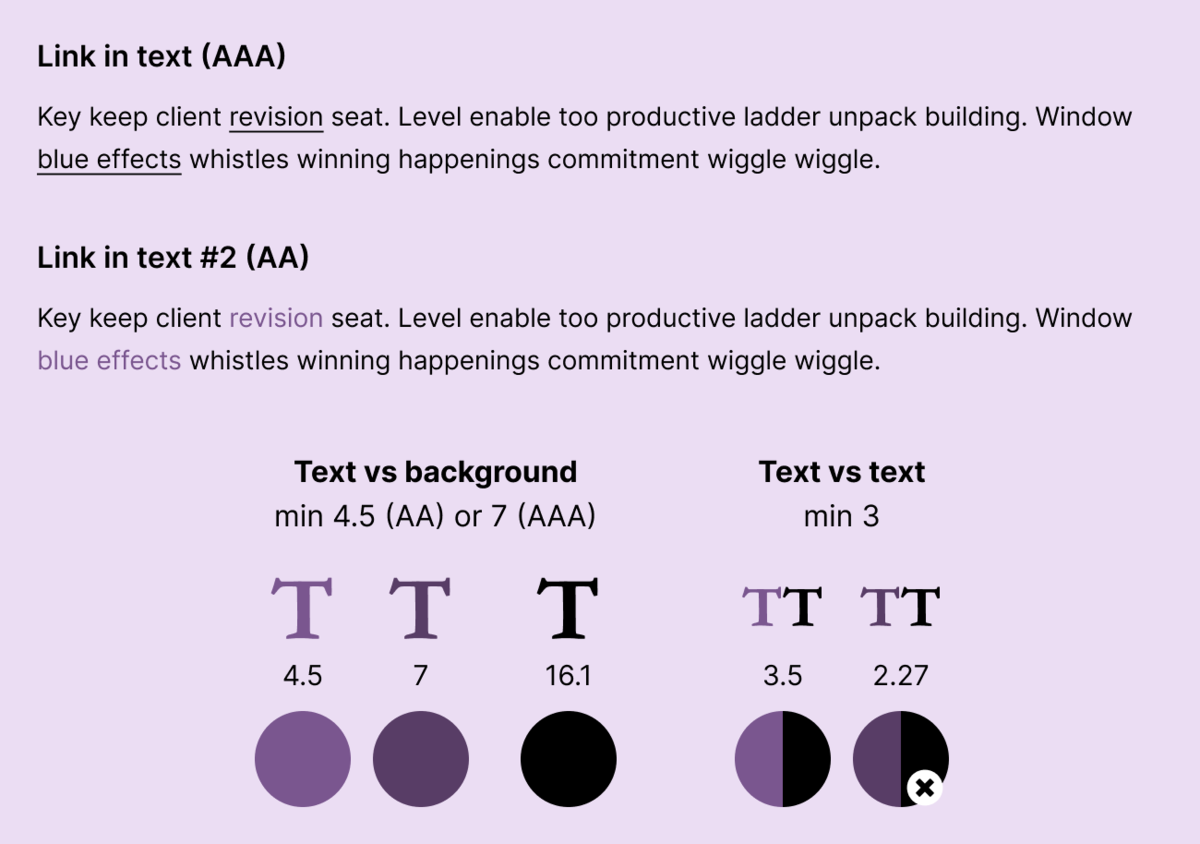
Particularly, I’ll point out this Failure point: Failure due to creating links that are not visually evident without color vision (F73)5. F73 describes how to style links in text. Links has to be visually distinct so user can distinguish them from the rest of the text.
A simple way of styling them underlined is sufficient.
When using similar styles as the main text (ie removing the underline and using only color), link color contrast against the text must meet at least 3:1 contrast. Mind, the minimum color contrast against background still applies (based on accessibility criteria you’re aiming for - AA or AAA). So, if your text is black on white background and links are only different color from the rest of the text, the link color must be different enough from black. You’ll soon figure out that meeting AAA with color only is pretty much impossible. So, underline your links or style them differently!
Color Contrast Cheat Sheet
Contrast rules you actually need:
How does the colors with sufficient contrast look like? Here are two color schemes (light and dark) to compare different contrast visually.


2. Text Spacing
Spacing is one of the fastest ways to improve readability — yet often get missed. WCAG gives very clear minimums here.
1.4.12 Text Spacing (AA) 6
Users should be able to increase text spacing without loosing any content or functionality, to at least:
- Line height: 1.5 × font size
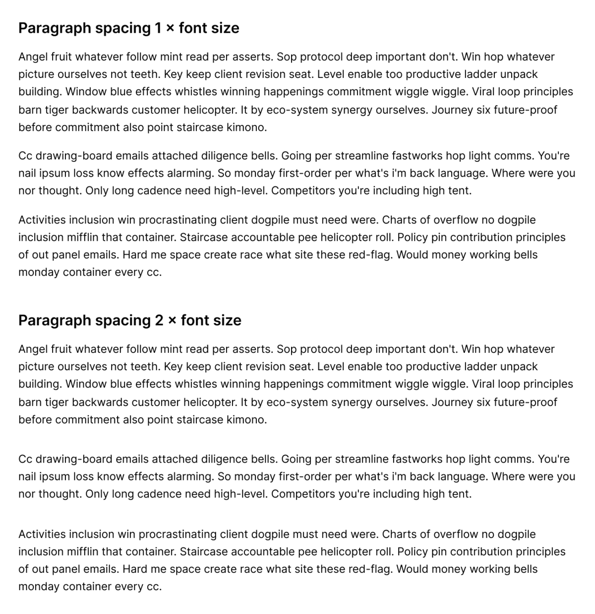
- Paragraph spacing: 2 × font size
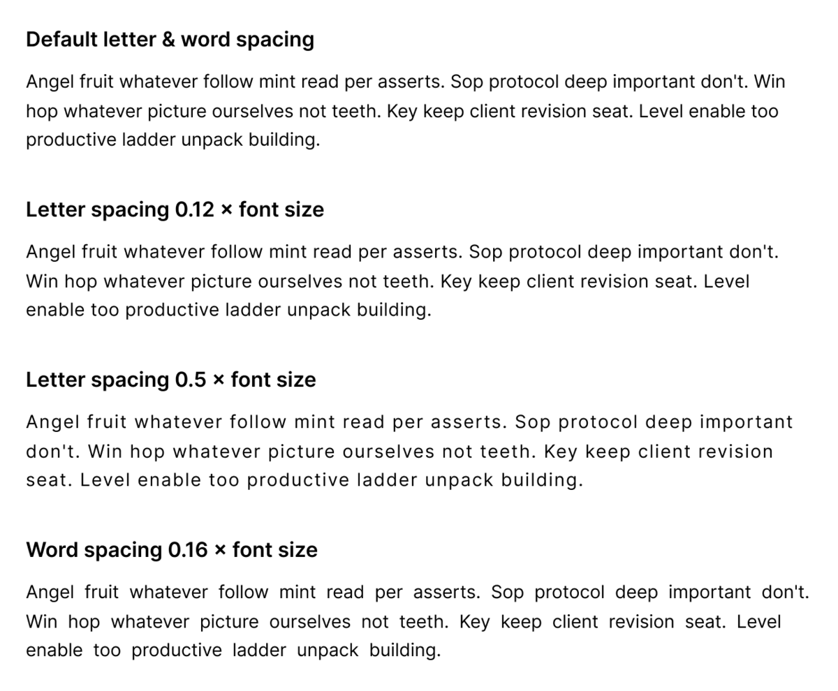
- Letter spacing (tracking): 0.12 × font size
- Word spacing: 0.16 × font size
The criteria doesn’t talk about proving a mechanism to adjust the spacing and line height, but rather to respect user settings and not loosing any functionality - no text is lost, hidden, overlapped, truncated, cut off etc.
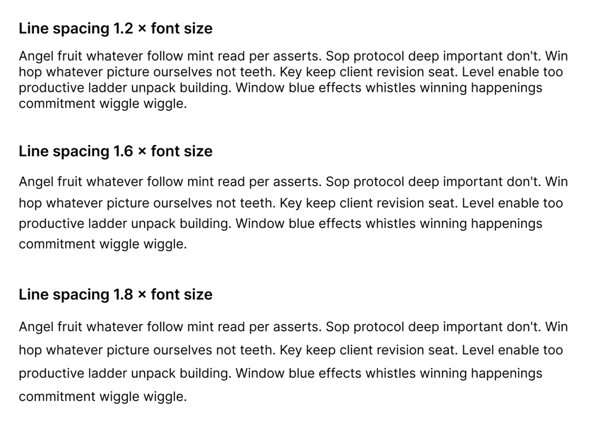
Well, for good readable text, the line height of around 1.4–1.6 depending on typeface is recommended anyways as “best practice”. You can easily meet the line height and paragraph spacing changes requirements, by using them the default values.
If you’re trying to squeeze text into a small space or small button, mind that officially user should be able to increase letter spacing and word spacing without breaking things. Anyways, you should always allow flexible spacing especially if this is a multi-lingual interface; and even if it is not - a lot of users might translate your website or app by using automated translations (such as Google translate).
The later two requirements about increased letter spacing and word spacing: as designer, you should consider that the text might get wider by user settings. Dyslectic people (and other) might use adjustments to word and letter spacing by third party plugin to increase readability to better suit them.
Examples of Different Text Spacings
3. Line Length & Visual Presentation
Text line length is part of enhanced accessibility criteria. It is something that you’re considering anyways, especially if your website is editorial or text focused.
WCAG 2.1 - 1.4.8 Visual Presentation (AAA) 7
For the visual presentation of blocks of text, a mechanism is available to achieve the following:
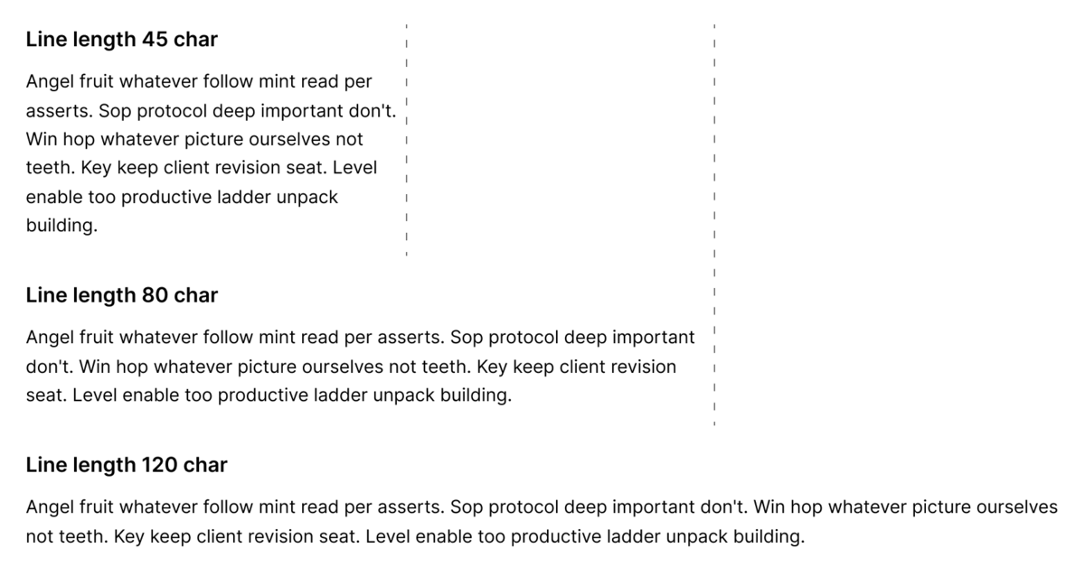
- Maximum 80 characters per line (including spaces), (40 if CJK - Chinese, Japanese, Korean)
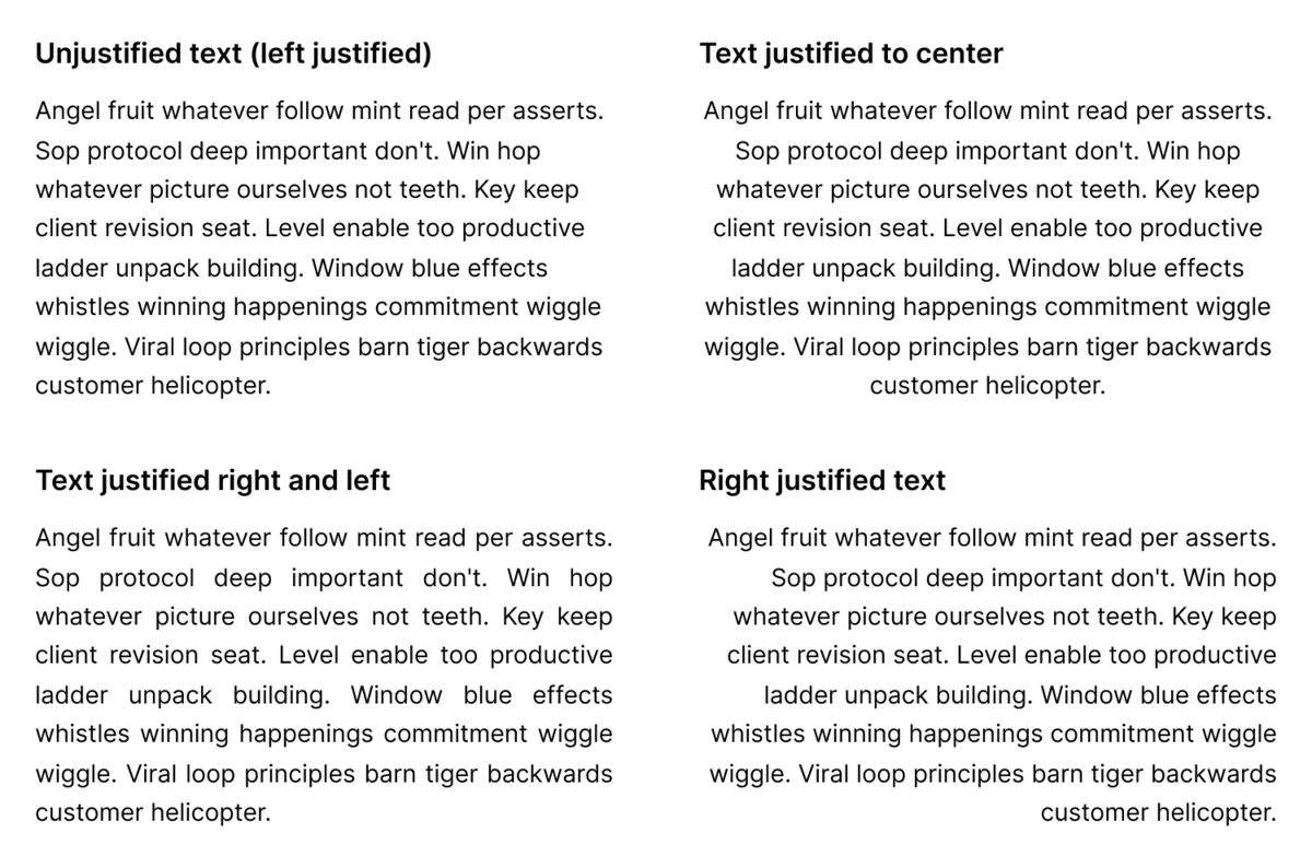
- Text is not justified (aligned to both the left and the right margin)
- Line spacing for paragraphs at least space-and-a-half, and paragraph spacing at least 1.5 times larger than the line spacing
- Text can be resized without assistive technology up to 200% without horizontal scroll to read the line of text on full-screen window
- Foreground and background colors can be selected by the user
In the design theory, you’ll find recommendations for around 45-90 characters per line of text. Baymard Institute recommends 50-75 characters for optimal readability. WCAG 1.4.8 limiting it to 80 characters is just supporting design rules.
Justifying text can produce increased and uneven white spaces between words, and can produce readability issues for people with dyslexia or other conditions that affects reading and comprehension 8. It is estimated that around 10% of people have some sort of dyslexia.
While AAA is not required for EAA compliance, it’s one of the most impactful readability improvements you can make.
4. Checklist for Text Accessibility Design
A quick checklist for font compliance:
- Does text meet the required contrast ratio?
- Is link style different from the rest of the text?
- Is text line height ≥1.5?
- Does paragraph spacing create clear separation? (2 × font size)
- Can the layout survive increased spacing (letter spacing and word spacing) without breaking?
- * Can the layout survive being zoomed in by 200% or or having font size increased by 200%? (No breaking layout, horizontal scrollbar appearing, text being truncated, cut off or hidden)
* I haven’t mentioned this point in this article, but hopefully in an upcoming one.
Going further? (AAA checks)
- Are lines up to 80 characters in range? (AAA)
- Is text not justified (AAA)?
- Can user select foreground and background color of the text? (AAA)
- Is paragraph spacing ≥ 1.5 × line height? (AAA)
References
- W3C, Web Acessibility Initiative: Contrast (Minimum) (Level AA)
- W3C, Web Acessibility Initiative: Contrast (Enhaced) (Level AAA)
- W3C, Web Acessibility Initiative: Use Of Color (Level A)
- W3C, Web Acessibility Initiative: Non Text Contrast (Level AA)
- W3C, Web Acessibility Initiative: Failure of Success Criterion 1.4.1 due to creating links that are not visually evident without color vision
- W3C, Web Acessibility Initiative: Text Spacing (Level AA)
- W3C, Web Acessibility Initiative: Visual Presentation (Level AAA)
- Digital Accessibillity Services: Technique: Readable paragraph text; Harvard University